Done


March of the Soviet Artillery (1943): Video – circa 1936-1947


Details
17 Jan 2014 15:02:00
A 700-year-old letter believed to have been in the possession of William Wallace

Duncan Fenton from the Society of William Wallace stands next to a 700-year-old letter believed to have been in the possession of William Wallace, which has returned to National Records of Scotland on January 12, 2012 in Edinburgh, Scotland. (Photo by Jeff J. Mitchell/Getty Images)
Details
20 Jan 2012 14:17:00
Charlotte Roirdan from Lyon & Turnbull views a letter written by Mary Queen of Scots

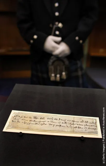
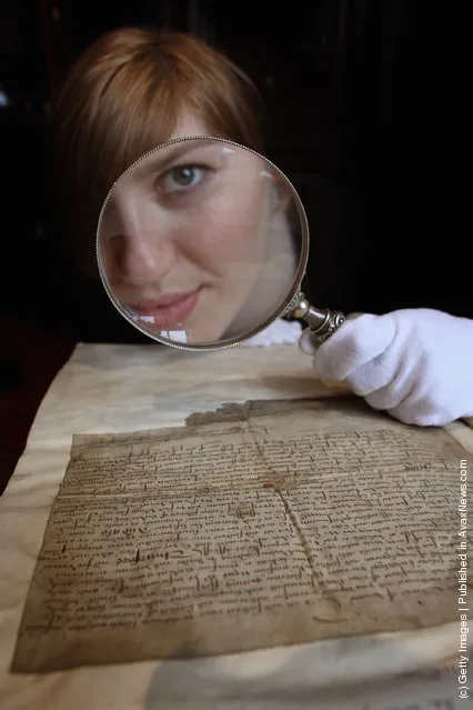
Charlotte Roirdan from Lyon & Turnbull views a letter written by Mary Queen of Scots on March 8, 2012 in Edinburgh, Scotland. The 450 year old letter, unearthed in Blair Castle in Ayrshire, has been verified as the hand writing of Mary Queen of Scotts and has been valued at 3,000 GBP. The letter, dated March 20, 1554, relieves the then laird of Blair from his duties due to gout and will be put up for sale next week at an auction in Edinburgh. (Photo by Jeff J. Mitchell/Getty Images)
Details
11 Mar 2012 10:19:00
Super Hero Minimalist Posters By Michael Turner Part 1

Have you ever heard of a psychological phenomenon which lets us easily understand words, even if the order of letters is mixed up, as long as the first and last letters remain in their rightful place? Similarly, the art works of Michael Turner use only two colors to highlight the main futures of well-recognized superheroes, allowing our imagination to create the rest of the picture. The colors used in the pictures weren’t chosen at random. They perfectly reflect the key characteristics of the superheroes that they depict. For example, the picture of Flash uses red and yellow colors, which are exactly the colors of his costume. While the picture of Green Lantern is, you’ve guessed it, green and black. (Photo by Michael Turner)
Details
10 Dec 2014 11:38:00
A woman walks past posters bearing the letter “Z” in the colours of the ribbon of Saint George, which has become a symbol of support for Russian military action in Ukraine, and reading “We are proud of Russia! We are not ashamed!” at a bus stop on Nevsky Prospekt in central Saint Petersburg on March 15, 2022. (Photo by AFP Photo/Stringer)

A woman walks past posters bearing the letter “Z” in the colours of the ribbon of Saint George, which has become a symbol of support for Russian military action in Ukraine, and reading “We are proud of Russia! We are not ashamed!” at a bus stop on Nevsky Prospekt in central Saint Petersburg on March 15, 2022. (Photo by AFP Photo/Stringer)
Details
17 Mar 2022 05:42:00


Eugene Lvovsky is a Graphic Designer/Artist from Toronto, Canada who makes art out of type - letterforms, outlines and fragments.
"Each letter, each little piece in my art is perfected by hand and placed very specifically to create a visually pleasing relationship between typographic characters and their unique shapes."
Details
08 Mar 2014 03:04:00
Writing Letter

“Kusakabe Kimbei (1841 – 1934) was a Japanese photographer. He usually went by his given name, Kimbei, because his clientele, mostly non-Japanese-speaking foreign residents and visitors, found it easier to pronounce than his family name. Kusakabe Kimbei worked with Felice Beato and Baron Raimund von Stillfried as a photographic colourist and assistant before opening his own workshop in Yokohama in 1881 in the Benten-dōri quarter, and from 1889 operating in the Honmachi quarter. He also opened a branch in the Ginza quarter of Tokyo”. – Wikipedia

Photo: Writing Letter. (Photo by Kusakabe Kimbei)
Details
21 Apr 2012 13:28:00
Alphabets Photographer By Bela Borsodi

Bela Bordosi is not the first person to arrange various household objects into the shape of the letters and making photos, and he’s definitely not the last. However, the way he does it is definitely very distinct and original. Sure, some photos are most definitely staged. However, some letters just pop out of the picture that doesn’t look staged at all. As if by chance, the items create a vivid “A” in your mind, so vivid that it’s very hard to notice the individual items that were used in the making of this composition. The reason behind it is probably because Bela Bordosi’s other photos are optical illusions created using a similar method. (Photo by Bela Borsodi)
Details
22 Oct 2014 13:41:00
Last searches: